Predicting Employee Attrition
Predicting Employee Attrition Case Study
Introduction
I’m going to be using fake (simulated) data from a Kaggle competition to predict future employee attrition.
Products
1. Proposed course of action
A proposed course of action will be recommended to address the key indicators correlated with employee attrition.
2. Predictive model
A predictive model will be provided that can be used to identify well-evaluated employees most at risk of quitting, so corrective measures (promotion, bonus, etc.) can be taken.
import numpy as np
import pandas as pd
import scipy.stats as scs

import matplotlib.pyplot as plt
import seaborn as sns

from sklearn.linear_model import LogisticRegression, LogisticRegressionCV
from sklearn.model_selection import train_test_split
from sklearn.metrics import (
    accuracy_score, precision_score, recall_score, confusion_matrix,
    roc_auc_score, roc_curve
)
from sklearn.preprocessing import MinMaxScaler
from sklearn.utils import shuffle
from sklearn.ensemble import AdaBoostClassifier
from sklearn.tree import DecisionTreeClassifier

import statsmodels.api as sm

%matplotlib inline
Exploratory Data Analysis
Let take a quick look at the data which came from kaggle.
data = pd.read_csv('data/complete_attrition_data.csv', index_col=0)

data.head()
| satisfaction_level | last_evaluation | number_project | average_montly_hours | time_spend_company | Work_accident | left | promotion_last_5years | sales | salary | |
|---|---|---|---|---|---|---|---|---|---|---|
| 0 | 0.38 | 0.53 | 2 | 157 | 3 | 0 | 1 | 0 | sales | low |
| 1 | 0.80 | 0.86 | 5 | 262 | 6 | 0 | 1 | 0 | sales | medium |
| 2 | 0.11 | 0.88 | 7 | 272 | 4 | 0 | 1 | 0 | sales | medium |
| 3 | 0.72 | 0.87 | 5 | 223 | 5 | 0 | 1 | 0 | sales | low |
| 4 | 0.37 | 0.52 | 2 | 159 | 3 | 0 | 1 | 0 | sales | low |
data.describe()
| satisfaction_level | last_evaluation | number_project | average_montly_hours | time_spend_company | Work_accident | left | promotion_last_5years | |
|---|---|---|---|---|---|---|---|---|
| count | 14999.000000 | 14999.000000 | 14999.000000 | 14999.000000 | 14999.000000 | 14999.000000 | 14999.000000 | 14999.000000 |
| mean | 0.612834 | 0.716102 | 3.803054 | 201.050337 | 3.498233 | 0.144610 | 0.238083 | 0.021268 |
| std | 0.248631 | 0.171169 | 1.232592 | 49.943099 | 1.460136 | 0.351719 | 0.425924 | 0.144281 |
| min | 0.090000 | 0.360000 | 2.000000 | 96.000000 | 2.000000 | 0.000000 | 0.000000 | 0.000000 |
| 25% | 0.440000 | 0.560000 | 3.000000 | 156.000000 | 3.000000 | 0.000000 | 0.000000 | 0.000000 |
| 50% | 0.640000 | 0.720000 | 4.000000 | 200.000000 | 3.000000 | 0.000000 | 0.000000 | 0.000000 |
| 75% | 0.820000 | 0.870000 | 5.000000 | 245.000000 | 4.000000 | 0.000000 | 0.000000 | 0.000000 |
| max | 1.000000 | 1.000000 | 7.000000 | 310.000000 | 10.000000 | 1.000000 | 1.000000 | 1.000000 |
left_grouped = data.groupby('left')
left_grouped.mean()
| satisfaction_level | last_evaluation | number_project | average_montly_hours | time_spend_company | Work_accident | promotion_last_5years | |
|---|---|---|---|---|---|---|---|
| left | |||||||
| 0 | 0.666810 | 0.715473 | 3.786664 | 199.060203 | 3.380032 | 0.175009 | 0.026251 |
| 1 | 0.440098 | 0.718113 | 3.855503 | 207.419210 | 3.876505 | 0.047326 | 0.005321 |
data.dtypes
satisfaction_level       float64
last_evaluation          float64
number_project             int64
average_montly_hours       int64
time_spend_company         int64
Work_accident              int64
left                       int64
promotion_last_5years      int64
sales                     object
salary                    object
dtype: object
fig, ax = plt.subplots(figsize=(10, 6))

(
    data
    .loc[data['left']==1, 'satisfaction_level']
    .hist(bins=np.linspace(0., 1., 20), normed=True, alpha=0.3, label='Left')
);
(
    data
    .loc[data['left']==0, 'satisfaction_level']
    .hist(bins=np.linspace(0., 1., 20), normed=True, alpha=0.3, label='Stayed')
);

ax.set_title('Satisfaction');
ax.set_xlabel('');
ax.set_ylabel('Proportion (Normalized)');
ax.legend();
fig, ax = plt.subplots(figsize=(10, 6))


(
    data
    .loc[data['left']==1, 'last_evaluation']
    .hist(bins=np.linspace(0., 1., 20), normed=True, alpha=0.3, label='Left')
);
(
    data
    .loc[data['left']==0, 'last_evaluation']
    .hist(bins=np.linspace(0., 1., 20), normed=True, alpha=0.3, label='Stayed')
);

ax.set_title('Last Evaluation');
ax.set_xlabel('');
ax.set_ylabel('Proportion (Normalized)');
ax.legend();
fig, ax = plt.subplots(figsize=(10, 6))

data.groupby('number_project')['number_project'].count().plot.bar();

ax.set_title('Number of Projects');
ax.set_xlabel('');
ax.set_ylabel('Count');
fig, ax = plt.subplots()

data.groupby('Work_accident')['Work_accident'].count().plot.bar();

ax.set_title('Work Accident');
ax.set_xlabel('');
ax.set_ylabel('Count');
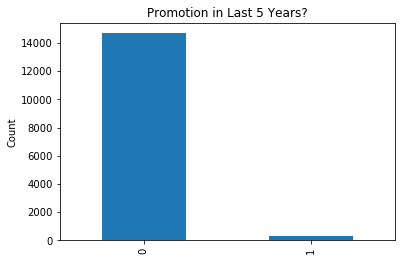
fig, ax = plt.subplots()

data.groupby('promotion_last_5years')['promotion_last_5years'].count().plot.bar();

ax.set_title('Promotion in Last 5 Years?');
ax.set_xlabel('');
ax.set_ylabel('Count');
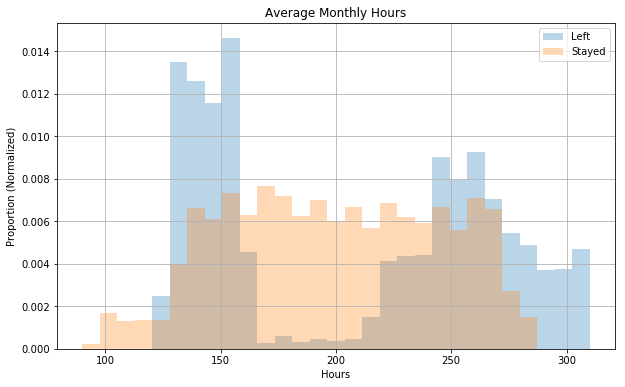
fig, ax = plt.subplots(figsize=(10, 6))

(
    data
    .loc[data['left']==1, 'average_montly_hours']
    .hist(bins=np.linspace(90, 310, 30), normed=True, alpha=0.3, label='Left')
);
(
    data
    .loc[data['left']==0, 'average_montly_hours']
    .hist(bins=np.linspace(90, 310, 30), normed=True, alpha=0.3, label='Stayed')
);

ax.set_title('Average Monthly Hours');
ax.set_xlabel('Hours');
ax.set_ylabel('Proportion (Normalized)');
ax.legend();
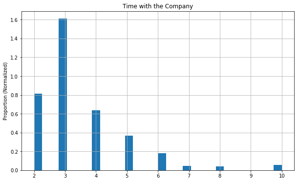
fig, ax = plt.subplots(figsize=(10, 6))

data['time_spend_company'].hist(bins=30, normed=True);

ax.set_title('Time with the Company');
ax.set_xlabel('');
ax.set_ylabel('Proportion (Normalized)');
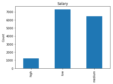
fig, ax = plt.subplots()

data.groupby('salary')['salary'].count().plot.bar();

ax.set_title('Salary');
ax.set_xlabel('');
ax.set_ylabel('Count');
fig, ax = plt.subplots(figsize=(10, 6))
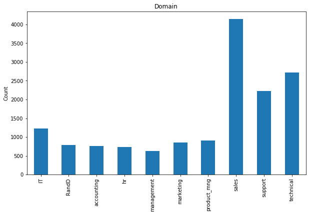
data.groupby('sales')['sales'].count().plot.bar();
ax.set_title('Domain');
ax.set_xlabel('');
ax.set_ylabel('Count');
fig, ax = plt.subplots()
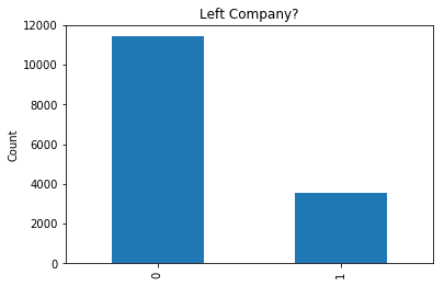
data.groupby('left')['left'].count().plot.bar();
ax.set_title('Left Company?');
ax.set_xlabel('');
ax.set_ylabel('Count');
data.rename(columns={'sales': 'domain'}, inplace=True)

data.isnull().sum()
satisfaction_level       0
last_evaluation          0
number_project           0
average_montly_hours     0
time_spend_company       0
Work_accident            0
left                     0
promotion_last_5years    0
domain                   0
salary                   0
dtype: int64
Features
Everything looks pretty clean and mostly useful, and there aren’t any missing values!
The sales column is improperly named and really means something like job area or domain, so I renamed it to domain. There’s a fairly good representation of all of the different employment classes.
There’s pretty unequal representation of salary classes in this data. Most people are “low”, some “medium”, and pretty few are “high”. This probably implies that it’s self-reported by the employee since most people have the bias that they’re being underpaid.
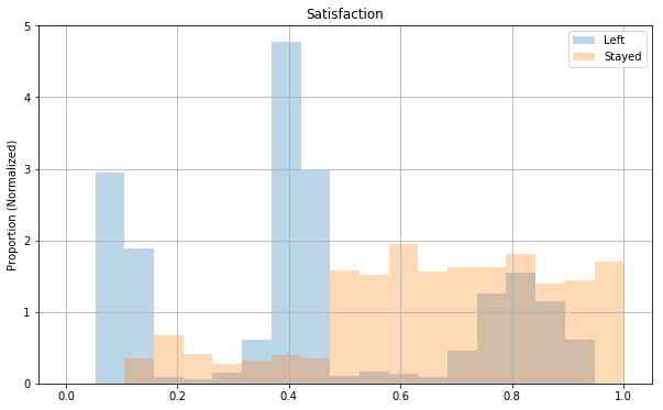
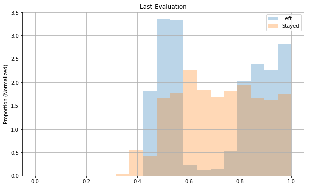
Both satisfaction_level and last_evaluation seem to be on some scale from 0 to 1, and they’re very roughly uniformly distributed. Both distributions seem kind of concentrated on the right side though close to 1.
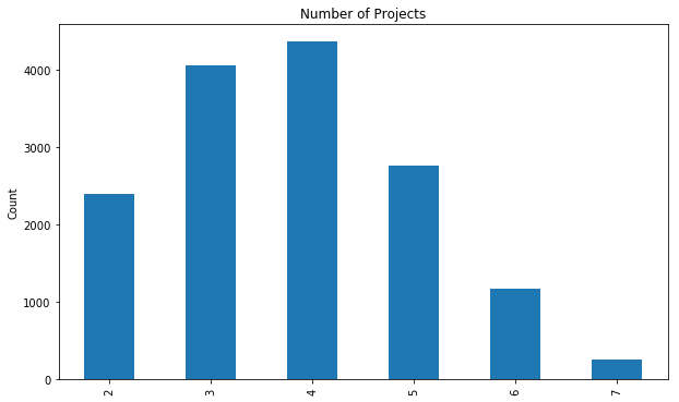
Number of projects seems somewhat normally distributed.
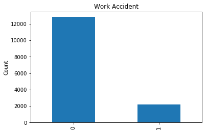
Generally speaking, few people have workplace accidents and very few seem to get promotions, which may help explain why so many think they’re underpaid.
Dependent Variable: left
A pretty sizable portion of people seem to have left the company.
Why? We can look at a correlation plot for some of the numeric values and some grouped plots to try to understand some of that.
num_features = [
'satisfaction_level',
'last_evaluation',
'number_project',
'average_montly_hours',
'time_spend_company',
'left'
]
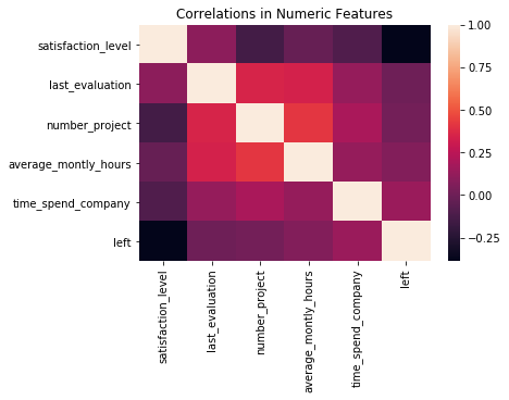
sns.heatmap(
data[num_features].corr()
).set_title('Correlations in Numeric Features');
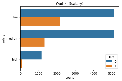
fig, ax = plt.subplots()

(
    sns.countplot(data=data, y='salary', hue='left')
    .set_title('Quit ~ f(salary)')
);
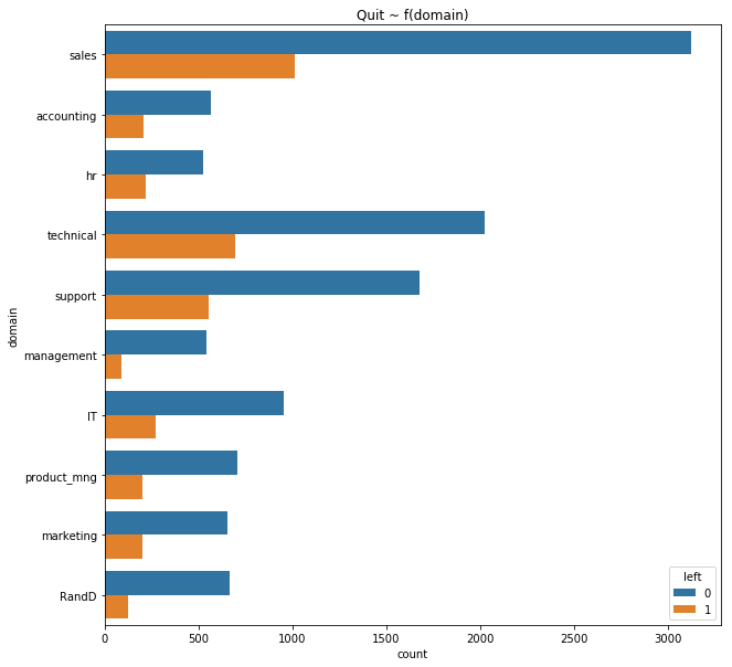
fig, ax = plt.subplots(figsize=(10, 10))

(
    sns.countplot(data=data, y='domain', hue='left')
    .set_title('Quit ~ f(domain)')
);
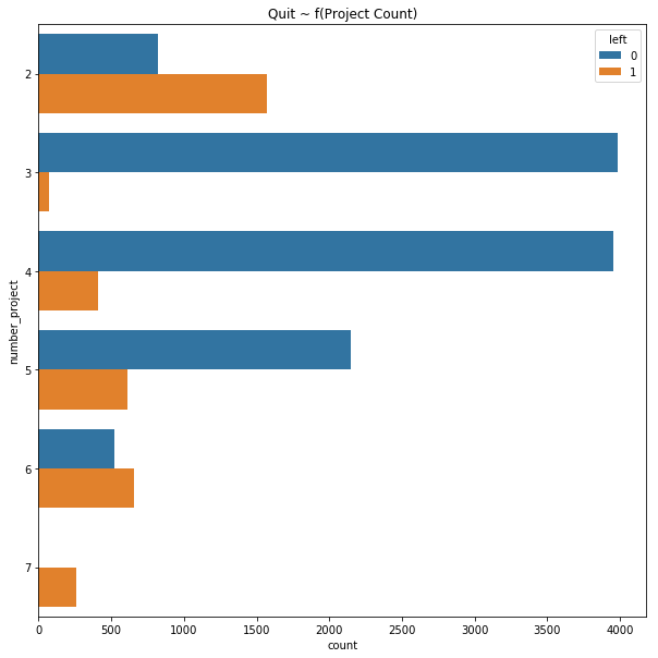
fig, ax = plt.subplots(figsize=(10, 10))

(
    sns.countplot(data=data, y='number_project', hue='left')
    .set_title('Quit ~ f(Project Count)')
);
Correlations
All of the correlations make intuitive sense. Low satisfaction and having very few projects seems to be correlated with leaving. last_evaluation, number_project, and average_monthly_hours are also correlated, which seems to suggest that someone with positive evaluations also tends to work more (shocker!).
First attempt at an interpretation
We’re starting to see patterns that suggest there are primarily two groups of people that are leaving: the over-worked high-performers and the low-performing, poorly-evaluated employees.
This aligns with the common belief that you want employees that are just barely competent for their roles. Over-qualified employees tend to be forced into positions in which they have to pick up the slack within an organization. Without recognition for their extra efforts, high-performers become disgruntled and leave. This is the kind of turnover that needs to be prevented!
Model
There are really two different ways to approach this problem depending on the particular business context.
The first is to use inferential statistics to build an explanatory model without optimizing the model for accuracy (or precision/recall in this case). This kind of model can allow stakeholders to “test” how different strategies may be able to change turnover.
The second approach is to simply create a model that’s as accurate as possible (maximizes ROC AUC score). This kind of model doesn’t offer the same explanatory power, but it does offer much more predictive power. This kind of model could be used in production to identify high performers at risk of leaving before they leave, so that corrective measures can be taken (most likely promoting them).
Inference with Logistic Regression
First, I’m going to make a logistic regression model to better understand the factors behind turnover.
# A new dataframe specifically for the logistic regression model
logistic_data = data.copy(deep=True)

cat_columns = [
    'domain',
    'salary'
]

# These need to be encoded as dummies for logistic regression
for col in cat_columns:
    # Get dummy encodings
    new_cols = pd.get_dummies(
        logistic_data[col], drop_first=True, prefix=col
    )
    logistic_data = pd.concat([logistic_data, new_cols], axis=1)
    # Drop original col
    logistic_data.drop(col, axis=1, inplace=True)

# This is just good practice IMO
logistic_data = shuffle(logistic_data)

independent_vars = [
    'satisfaction_level',
    'last_evaluation',
    'number_project',
    'average_montly_hours',
    'time_spend_company',
    'Work_accident',
    'promotion_last_5years',
    'domain_RandD',
    'domain_accounting',
    'domain_hr',
    'domain_management',
    'domain_marketing',
    'domain_product_mng',
    'domain_sales',
    'domain_support',
    'domain_technical',
    'salary_low',
    'salary_medium'
]

dependent_var = 'left'

X = logistic_data[independent_vars]
y = logistic_data[dependent_var]

X_train, X_test, y_train, y_test = train_test_split(
    X, y, test_size=0.15, stratify=y
)

# Logistic regression with SKlearn
log_reg = LogisticRegressionCV(
    class_weight='balanced', Cs=10, penalty='l2', n_jobs=-1,
    scoring='roc_auc'
)

log_reg_model = log_reg.fit(X_train, y_train)

print "Accuracy:", log_reg_model.score(X_test, y_test)
print "ROC AUC Score:", roc_auc_score(y_test, log_reg_model.predict(X_test))
Accuracy: 0.757777777778
ROC AUC Score: 0.774338633553
This is great and all, but doesn’t really help explain the relationships. For that,
the statsmodels library, which has an R-like interface, is much better.
# Logistic regression with statsmodels
# This allows us to easily look at summary info about the model

min_max_scaler = MinMaxScaler()

logistic_data[independent_vars] = min_max_scaler.fit_transform(logistic_data[independent_vars])

logistic_data['intercept'] = 1.0

stats_logit = sm.Logit(
    logistic_data[dependent_var],
    logistic_data[['intercept'] + independent_vars]
)

result = stats_logit.fit()

print result.summary()
Optimization terminated successfully.
         Current function value: 0.428358
         Iterations 7
                           Logit Regression Results
==============================================================================
Dep. Variable:                   left   No. Observations:                14999
Model:                          Logit   Df Residuals:                    14980
Method:                           MLE   Df Model:                           18
Date:                Wed, 27 Sep 2017   Pseudo R-squ.:                  0.2195
Time:                        16:24:03   Log-Likelihood:                -6424.9
converged:                       True   LL-Null:                       -8232.3
                                        LLR p-value:                     0.000
=========================================================================================
                            coef    std err          z      P>|z|      [0.025      0.975]
-----------------------------------------------------------------------------------------
intercept                -1.4326      0.161     -8.907      0.000      -1.748      -1.117
satisfaction_level       -3.7635      0.089    -42.177      0.000      -3.938      -3.589
last_evaluation           0.4678      0.095      4.899      0.000       0.281       0.655
number_project           -1.5754      0.107    -14.775      0.000      -1.784      -1.366
average_montly_hours      0.9545      0.110      8.643      0.000       0.738       1.171
time_spend_company        2.1420      0.125     17.192      0.000       1.898       2.386
Work_accident            -1.5298      0.090    -17.083      0.000      -1.705      -1.354
promotion_last_5years    -1.4301      0.258     -5.552      0.000      -1.935      -0.925
domain_RandD             -0.4016      0.136     -2.962      0.003      -0.667      -0.136
domain_accounting         0.1807      0.122      1.480      0.139      -0.059       0.420
domain_hr                 0.4131      0.121      3.415      0.001       0.176       0.650
domain_management        -0.2677      0.152     -1.765      0.078      -0.565       0.030
domain_marketing          0.1686      0.122      1.386      0.166      -0.070       0.407
domain_product_mng        0.0275      0.120      0.230      0.818      -0.207       0.262
domain_sales              0.1419      0.089      1.601      0.109      -0.032       0.316
domain_support            0.2307      0.097      2.391      0.017       0.042       0.420
domain_technical          0.2509      0.093      2.685      0.007       0.068       0.434
salary_low                1.9441      0.129     15.111      0.000       1.692       2.196
salary_medium             1.4132      0.129     10.924      0.000       1.160       1.667
=========================================================================================
Interpretation
The following analysis used an $\alpha$ of 0.05 (95% confidence). I want to emphasize that this is not a causal analysis. The following items are correlated, but that does not necessarily imply causation. In order to make statements about causality, I’d either need to know more about how the data was attained or have some flexibility in designing an experiment and collecting new data.
Controlling for other factors the following indicators likely suggest an increased probability of quitting in the order from most to least measured effect:
- Poor satisfaction
- Longer history with the company
- Low Salary
- No recent promotion
- Fewer projects
Departmental differences
Both management and R&D seem to have lower turnover than other departments, but it’s somewhat hard to determine to what extent because the data isn’t well represented in all departments. It also isn’t possible to say why those departments seem to have less of a problem with turnover, but it’s reasonable to make the assertion that it may have something to do with the management structure within these departments.
Suggested actions to address causes
The following strategies may help reduce turnover:
- Recognize high achievers and offer them promotions.
- Reduce high performer workload by hiring more high performers.
- Create more incentives to stay long term. Spending a longer time at the company makes people more likely to want to leave right now.
- Try to prevent employees from working long hours to limit dissatisfaction.
- Try implementing management styles in use within the R&D and Management departments company-wide.
Approach 2
Identify high risk employees
I’m going to introduce a new class of employee that left and had positive evaluations above a certain threshold (I selected 0.75). These are precisely the employees that we most want to stay. A purely predictive model can then be built which can be used by the client to identify at-risk employees before they quit.
# We want to capture the class of employees that had evaluations
# above 0.75 and quit. These are the "high_achievers"
evaluation_threshold = 0.75

ada_data = data.copy(deep=True)

ada_data['high_achievers'] = 0
ada_data.loc[(
        (ada_data['left'] == 1)
        & (ada_data['last_evaluation'] >= evaluation_threshold)
    ),
    'high_achievers'
] = 1.0

cat_columns = [
    'domain',
    'salary'
]

# These need to be encoded as dummies for logistic regression
for col in cat_columns:
    # Get dummy encodings
    new_cols = pd.get_dummies(
        ada_data[col], drop_first=True, prefix=col
    )
    ada_data = pd.concat([ada_data, new_cols], axis=1)
    # Drop original col
    ada_data.drop(col, axis=1, inplace=True)

# This is just good practice IMO
ada_data = shuffle(ada_data)

bdt = AdaBoostClassifier(
    DecisionTreeClassifier(max_depth=6),
    algorithm="SAMME",
    n_estimators=400,
    learning_rate=0.5
)

X = ada_data[independent_vars]
y = ada_data['high_achievers']

X_train, X_test, y_train, y_test = train_test_split(
    X, y, test_size=0.15, stratify=y
)

bdt.fit(X_train, y_train)

print "Accuracy:", bdt.score(X_test, y_test)
print "Precision:", precision_score(y_test, bdt.predict(X_test))
print "Recall:", recall_score(y_test, bdt.predict(X_test))
print "ROC AUC:", roc_auc_score(y_test, bdt.predict(X_test))
Accuracy: 0.994666666667
Precision: 0.975352112676
Recall: 0.982269503546
ROC AUC: 0.989356296488
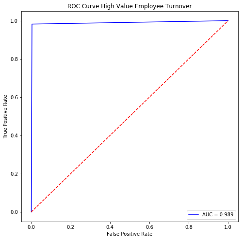
fpr, tpr, thresholds = roc_curve(y_test, bdt.predict(X_test))

fig, ax = plt.subplots(figsize=(8,8))

ax.plot(
    fpr, tpr, 'b-',
    label="AUC = {:.3f}".format(
        roc_auc_score(y_test, bdt.predict(X_test))
));
ax.plot((0, 1), (0, 1), 'r--');

ax.set_title("ROC Curve High Value Employee Turnover");
ax.set_xlabel("False Positive Rate");
ax.set_ylabel("True Positive Rate");
ax.legend(loc='lower right');
# sample probabilistic estimate of turnover on new data

bdt.predict_proba(X_test)[:3]
array([[ 0.46431256,  0.53568744],
       [ 0.62217896,  0.37782104],
       [ 0.58520321,  0.41479679]])
Final Thoughts
This model performs pretty well. It could be used in real time to quickly identify employees with a high probability of quitting. Even with a small budget, a company could use this model to quickly identify the most at-risk high-performers and offer them packages before it’s too late!